

Photo: Madison Inouye / Pexels
So many log home owners fall into the trap that a log home has to be all brown, all the time. Not true! Color has the power to affect our moods, our creativity — even our appetites! It can transform a space from cold and sterile to warm and inviting, so why not use it to its fullest potential? To spark a little log cabin creativity, we've uncovered the basic meanings of your favorite colors and offer a a few ideas (and examples) as to how you can incorporate them into your log home. (Keep in mind that these are western culture values and are subject to interpretation and even religious differences.)
Table of Contents:
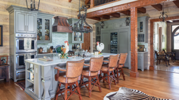
Black:

Photo: Roger Wade / See more here.
In the log home pictured above, black cabinets add striking contrast to the pale knotty-pine log walls, while quartz countertops, a soapstone farmhouse sink and stainless steel appliances round out the efficient kitchen’s offerings. Tour this little log cabin here.
Yellow:

Photo: Courtesy of Summit Log & Timber Homes / See more here
This color may be energetic and alive, but in fact, yellow causes more eye fatigue and arguments than any other color. In small doses, yellow is a friendly and happy complement to other colors like white and brown.
Orange:

Photo: Courtesy Coventry Log Homes / See more here
Orange exudes vitality, life and cheerfulness. Orange improves appetites without being ravenous. Terra Cotta colored dining rooms helps satisfy full bellies. A great accent to brown, black and shades of white. Word to the wise: take care with this hue. Many log home walls have naturally orange undertones. Your shades could clash or you could suffer from orange overload.
The New Hampshire log home pictured above showcases orange's range by using a soothing shade of terra cotta in the upstairs bathroom. Click here to see the full tour.
Red:

Increased blood pressure and appetite. It’s great as an accent in small doses, or to build drama in large amounts. Red is stimulating and can cause people to lose track of time- great for home gyms or increasing productivity in offices. Red is one of the most difficult colors to “get right” in monochromatic schemes. It can have a pink, purple, black, brown, or yellow cast to it, much like beiges.
Purple:

Except in florals, a saturated purple is not a commonly naturally occurring color, with the exception of the sky. Historically, it is the color of royalty, as fabrics and anything purple were expensive and difficult to obtain in patriarchic societies. Deep shades are opulent and mysterious, while lavenders are soft and feminine. Purple is a tricky color to blend with a lot of wood tones and needs to be chosen carefully. Paired with gray it can be stunning.
Soft mauve paint and white linens in one of two upstairs bedrooms makes for a tranquil respite for the owners of this log home. Click here to see it all.
Pink:

Another challenge to enter into a log home/timber design scheme except for feminine and beachy themes. Soft pink reduces anger and aggression and bright pinks are energizing and indicate you are a true risk taker.
Blue:

A favorite across genders, it is also a color found in nature, and therefore a great pick for rustic homes. Blues relax and center a space. Spiritual and restful, great for bedrooms and studies, where blue is actually proven to increase concentration and productivity. Blue is loyal and dependable and one of the most popular colors of all time.
Green:

The new "neutral" of the 21st century, green is the most common color found in nature. It is alive and represents health and healing. Lighter shades are timeless, while lime and teal make great trendy accents.
Green is one of the best colors to use in a custom wood home because it maintains the natural aesthetic of the home. These homeowners chose light green walls for their entry, creating a soothing and pleasant nature-inspired welcome. See more of this log home here.
Gray:

Gray is often the forgotten neutral, and if the right shade is chosen, can be cozy or clean and not drab. Gray invites creativity and production in offices and studies, as it is not distracting. Grays can be very stylish and sophisticated, and with a little brown mixed in look great in contemporary timber homes as well as in the silver patina of traditional early American style.
In the hybrid log and timber home pictured above, clear-coated white pine logs create an airy and bright backdrop for sleek grey cabinets. Click here to see more of this home.
Brown:

Photo: Courtesy Winterwoods Home / See more of this home here.
The color of wood, varied shades of brown are the epitome of strength, warmth and security- no wonder the perfect backdrop in a log home! Browns live forever and hide dirt and wear extremely well. Make browns pop with an unexpected bright color punch, add soft color with a pastel, or warm it up with spicy colors like yellow, orange and red.
When it comes to wooden homes, brown is an expected element of the home's interior design. These homeowners managed to effectively incorporate the color brown beyond the logs of their home with leather and velvet touches, as well as pops of red. See the full tour of this fire tower-inspired home here.
White:
A blank, fresh canvas; feels cool, pure, bright and airy. Clean, but has a tendency to feel sterile and uncomfortable if too stark or lacking layered textures.
A white motif in this bedroom gives the room a light, relaxed appearance. The white bedding and walls enhance the clean look of the room, which is only complemented by the fresh flowers and bright windows. See more of this home here.
See also: How to Choose a Stain for Your Log Home